welcome welcome welcome and such..

welcome to my AS media project blog, this blog will be my "diary" of the whole year and the progress i make.
i hope it's up to standards and i know i'll enjoy putting it together, as much as you enjoy reading it maybe? ;p

mmm..

mmm..

Thursday, May 13, 2010

Final OTS SUCCESS :'D

i just realised the OTS i have here on the blog is missing the "produced by" and the "starring" frames, which are on my latest OTS.
hopefully if it uploads in time it will be available here:


http://www.vimeo.com/user3790494/videos
or here:
http://www.motionbox.com/filings?folder_id=78796367


IT WORKED, so here it is, my final OTS.

"Doppelganger"

x

Prezi Evaluation

Thursday, March 4, 2010

Random litte Update for y'all.

On January 26th 2010, Avatar overtook Titanic in the worldwide boxoffice, The epic movie, set in the year 2154, raked in a staggering 1.841 billion, becoming the best-selling international release of all time.


Opening Title Sequence Update

well..
well..
well..
Despite the fact my OTS wasn't quite finished, i asked my teacher and a few students to view what progress i had made so far. The feedback i got was positive despite the fact i was being very precise about audio - i insisted that some of the diegetic sound was shifted out of place but nobody else noticed.
I then asked Jamie Reeves to view my OTS and help me cut it down and make it "speedier" he advised i cut some of the walking out and speed up the cuts as the Femme Fatale enters the room, i trial ran this and it worked much better, the pace of the whole OTS speeding up til the end. So i kept the improvements, Thank you Jamie :')
I've now added more non-diegetic sound and removed diegetic that was unnecessary, i now just need to add my Film Title to the end and i will ask more people from different age groups to view my finished OTS and review it.
x

Monday, March 1, 2010

Sound Effects ( Non-Copyrighted )
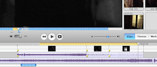

Obviously i couldn't leave the original audio in, it altered throughout the scenes (level of volume, cars/absence of cars, people, wind) which would be irritating to the audience and maybe a bit confusing. And so i removed the majority of the audio except the sounds which i found were important - footsteps, doors shutting, phone dropped, i kept these because they are the key signifiers for Film Noir in my OTS and they create tension in the scene. They play a certain role in my OTS, for instance the footsteps not only create the sufficient tension but also add the the contrast factor that i want (the contrasting footsteps, pattering of Victim and heavy heels of Femme Fatale). What i rid from my OTS is the diegetic. accidental sound as it played no particular role in my story-line, such as cars starting or planes passing over are not necessary to my OTS and so removing them allows more focus on important audio (footsteps). Plus i can add music or sound effects later on as an under-laying sound.

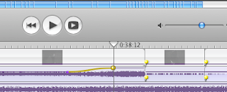
cutting and overlaying audio/sound-effects

I decided to keep some sounds that i could overlay sound effects over the top of, I kept certain sounds which I then made louder than the sound effects when necessary, therefore blocking out accidental or unnecessary noise that may be paired, I could make unnecessary noise quieter or cut it out altogether.

altering the volume of certain sounds
I don't personally have access to a medium of creating sound effects but was kindly provided with a some discs CHOCK-A-BLOCK with sound effects to choose from (Special FX, Atmosphere/Ambient).

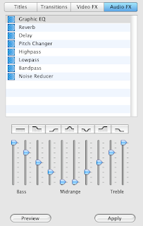
ways in which i can alter my sound (reducing, heightening, bass, delay)

What did i do different? Well i want my OTS to provoke questions in the audience about the story-line and so for that reason i decided to keep and remove certain conventions. I decided against using music, i felt that music can reveal too much about the story-line (lyrics) or can be too informative about the mood of the characters or the scene, for that reason id decided to use a series of underlaying sound effects, many long-struck notes that blend together alongside a heart beat to create tension, only the heartbeat revealing when the tension picks up in the character themselves.
I also decided against a voice over, again because a voice over can be too revealing of what's happening, yes a voice over is typical of a Film Noir Genre but i chose not to be bound by those conventions fully, as i don't want to reveal too much to the audience by telling them straight exactly what's happening and how my characters are feeling (are they expecting what is about to happen? are we watching a memory? etc).


Friday, February 26, 2010

What Can I Learn From The Bloopers?


I thought I'd add the bloopers on, as a learning tool - because despite how it appears, i learnt a lot from all the things that went wrong - These being just some of them.

Clip One (Actor bangs arm)
Clip Two ( Zana points at plane)
Clip Three (Zana false grin)
Clip Four (Tripod Antics)
Clip Five (Lamp falls on Zana)
Clip Six (Dancing Frog Girl)

(Clips 1 and 5) Coordinate exactly what happens on screen.
It would be sensible also for continuity, to plan out exactly what the actor does, this way continuity flows and the actor cannot hurt themselves via stepping too far forward. It was my mistake that i did not position the lamp switch close enough to Zana and she pulled it off, the next shot i positioned the switch so it was easy to reach and the shot worked.

(Clip 2 and 3) similar to the last point, my actor must have motivation, the must have something to work with during a shot. The first shot i took i told Zana just to walk and talk to me, this failed (as you can see in the Blooper) as we had mind blanks, so i gave her the motivation that she "wanted to tell me something" but "i had to go" and the shot worked because we had some audio to work with and the body language matched (which is what we needed). Same with clip three, i said to Zana "grin" but i wanted a sly grin, she gave me manic :'') so i have to specify, this was the same with my brother - i wanted a shadow disappearing as the FF appeared and asked him to stunt double run (Zana's half-hearted, looking around her, hurried walk) and he SPRINTED because i didn't specify.

(Clip 4 and 6) Being professional isn't majorly important but pick an actor who knows the severity of the scene, or the deadline, because at times the focus can be lost on both sides :')
Zana mucked around sure, but she got the job done too.

Also.. in Clips 1 and 5, Zana actually hurts herself. Now it is vital that precautions are taken when filming, we must identify any dangers and work to avoid/prevent them. In my case I made sure Zana stepped on a certain spot as to not hit her elbow and I placed the lamp switch in close range so she needn't reach for it.

And i almost forgot to mention a great complication in filming. As the door was frequently opened in my room by Zana during filming, the lovable mongrel native to my room was understandably confused to why she was removed and locked in the kitchen, and so snuck out and came into the room during filming on multiple occasions.
Solution was to put her outside during filming so she couldn't sneak back in, it's important to eliminate ( in a nice way ) or avoid the public, be it people on the street or animals.
Luckily Cassie was welcomed back after filming (:

x


Thursday, February 25, 2010

Location Justification (:

LOCATION LOCATION LOCATION
LOCATION LOCATION
LOCATION
I was very quick to choose that certain alleyway for my OTS, I knew when I'd finished my storyline where it would be shot and so went to the alleyway to observe it's potential. The lighting was very important and I felt the street lamps cast a very eerie glow and created distinct shadows that I really wanted for my Opening title sequence.
It was also very quiet so I knew we would have little or no interference (which we didn't during shooting apart from when we were outside the alleyway alongside Park Rd, a very long and busy road - see googlemaps and search "park road, spixworth").
The area around and overlooking to alleyway is very suburban and so i felt it fit the character's normal, comforting environment - yet it is morphed by nightfall. The fences along the alleyway also continue a fair way and are very high, this could link with the character feeling trapped or claustrophobic, running endlessly.
I then decided it would be a sensible idea to being filming before night fall as to establish which would be more suitable:
- filming in the light and darkening my film during the editing stage.
- or risk filming in the dark and hoping it will lighten during the editing stage.


In the first image you can see the street lamp gives off a very bright glow that (on the night of filming) also illuminated the damp ground adding to that surreal atmosphere i wanted to achieve, my character doesn't quite believe what's happening - either she knows who sent her the text and can't quite acknowledge that she's been found, or she's so taken aback by the text, it frightens her and sends her into panic - i want the closed in alleyway to reflect her feelings in comparison to the open road she stood alongside moments before.. in the presence of cars and a person she knows. I love the alleyway's suitability simply for the eerie way the light bounces along the alleyway, along the ground and the fences.

We came prepared each night with an umbrella just in case the weather turned on us and so the camera would be undamaged and the filing unaffected (water droplets on lense). Also for health and safety during filing, an adult attended during filming with the knife - to warn of passers by and in case a passerby was to question our motive to carry a knife in an alleyway (':
x

Tuesday, February 23, 2010

Very First edit of Raw Footage

NOTES
1. needs to be reduced to 2 1/2 minutes
2. remove dog bark (accident!)
3. lighten and darken some frames
4. add effective transitions
x

Comparative characters

Femme Fatale and Victim Costume Comparison
I felt I would challenge myself to have two main characters in my opening title sequence played by the same actress, I want the audience to make this link yet see a significant difference between the two not just by their appearance but also in the personality/tendencies/expressions.
Femme Fatale - Victim - Both
Image One - Jacket
Image Two - Outfit
Image Three - Shape and Personality Shown
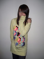
Image Four - Footwear
Image Five - Hair
Image Six - Makeup etc

Image One - Jacket
Image Two - Outfit
Image Three - Shape and Personality shown
Image Four - Footwear
Image Five - Hair
Image Six - Makeup etc

A femme fatale (French: [fam faˈtal], is an alluring and seductive woman whose charms ensnare her lovers in bonds of irresistible desire, often leading them into compromising, dangerous, and deadly situations. She is an archetypal character of literature and art. Her ability to entrance and hypnotize her male victim was in the earliest stories seen as being literally supernatural, hence the most prosaic femme fatale today is still described as having a power akin to an enchantress, vampire, female monster or demon.
I wanted this description to be reflected in my character, i felt it should be about SHAPE and CONTRAST.

Image One: I originally didn't plan for my actor to wear jackets during shooting but due to unexpected weather i felt it would be cruel not to allow it, and so i made sure that the jackets still fit the character - in the case of the Femme Fatale the jacket is black to match the rest of the outfit, is tailored so it fits to the actor's body shape and promoting the femme fatale's "alluring appearance" yet it doesn't cover the rest of the outfit. it fits the femme fatale criteria because it shapes my actor and creates an hourglass figure (as does the dress).
For my victim, it was less about shape and more about patterns, colours would have been appropriate but Film Noir Genre is generally black and white so I felt patterns and symbols would be more appropriate. For her jacket, we chose loose fitting and boasting large checkered-print - as it reflects in my mind a youthful personality ( happy-go-lucky ).

Image Two: The outfit for Femme Fatale is black - so creates a darker silhouette when contrasting light in the alleyways, the dress shapes my actor and has interesting movement, plus the dress allows my actor to wear the desired heels ( for the chosen sound effect during travel ). It fits a "Gothic" stereotype which fits in with the Femme Fatale meaning, in the past linking the FF's charms and power over men - to witchcraft etc.
For my Victim we are attempting to give a "youthful" (sorry for repetition of the word "youthful") appearance and so I put her in a shapeless jumper which created the boyish frame we wanted, and it has recognisable/mainstream characters visible on it's front. I then put her in jeggings which made her legs look slim (boyish frame). Through this kind of wear, we want the audience to see an "everyday" kind of girl, average and normal.
Image Three: The full outfit for the Femme Fatale creates an hourglass shape which is very appropriate to the FF character, i wanted the contrast between a boyish/youthful shape of the victim and the curvaceous figure of the FF, and the dress creates the appropriate silhouette i wanted and the skirt is layered and so has an interesting movement when my actor walks. Personality-wise during the OTS, I wanted my audience to see an alluring, charming yet slightly manic character, she's doing a horrible thing yet she grins in pursuit and once the deed is done - at one point the audience may even get the idea she is reconsidering , but she is only weighing up her methods - she's a ruthless femme fatale with a crazed mind.
For my Vitim we are attempting to give a "youthful" (sorry for repetition of the word "youthful") appearance and so i put her in a shapeless jumper which created the boyish frame we wanted, and it has recognisable/mainstream characters visible on it's front. I then put her in jeggings which made her legs look slim (boyish frame). Through this kind of wear, we want the audience to see an "everyday" kind of girl, average and normal. (taken from last image), personality wise we want to give the audience an innocent girl, isn't aware of the situation she's in - only that she is in danger, she is being pursued and so she doesn't hesitate in running. She's young and so maybe a bit gullible or naive (instant fright at the text message she receives).

Image Four: Footwear i felt was important, i wanted the contrast between the "pattering" of the flat shoes (Victim) as she tried to run away and the slow, confident, heavy pace of the heels (Femme Fatale). I wanted to show that the Femme Fatale was ruthlessly confident, she needn't run in her heels, she will find the Victim at whatever pace she chooses.
While the Victim wears flats with patent bows, giving us a weak, pattering as she runs - reflecting her own weakness against this FF.

Image Five: The hair of my femme fatale is curled, i felt this could not only reflect her alluring appearance but i also over-curled the hair giving it a wild/unkempt appearance at certain angles, this reflecting her manic personality that is revealed in certain frames.
The victims hair is very simplistic (schoolgirl you could call it), shiny and appears clean cut when straightened but also average linking to her average appearance and lifestyle.

Image Six: Hair and makeup for femme fatale was exaggerated, the eyeliner is bold and eccentric, it's carefully applied along with a lot of mascara, this AGAIN reflects her alluring, charming stereotype. She also has black nail varnish, i felt this would be dramatic and contrasting to her pale skin especially in extreme lighting and so would be effective in a Film Noir Genre. The Victim wore little mascara and lots of glitter which can be seen in the OTS ( coloured makeup not being an option in a B+W ots), glitter is a child/teenage accessory so thsi fits the character well. Her makeup also matched her nail varnish, both are pale and diverse in comparison to the femme fatale's.

x

Monday, February 22, 2010

On the Same Day..

We then decided to make the final arrangements for costume, assuring they fit my script and the Film Noir genre to a certain extent. I decided to challenge myself into having
two characters in my OTS played by the same person, the challenge being:
Make them as diverse as possible and challenge the audience to make a recognition - create questioning:
Are they related?
Are they clones? (haha!)
Is this deliberate?

The idea for my OTS is that these character's are doppelgangers, one pursuing the other, so i tried to make them as different as possible but still allowing the audience to make the link with ease.
I felt the Victim must appear as innocent and as diverse to the Femme Fatale as possible, and so i dressed her in clothes that did not shape her (youthful wear) yet posed bold shapes (checkered print, characters, bows), i also put her in flat shoes as this was completely different to the FF and implied little-threat. She applied little make-up in comparison.

Comparitive pictures in next post
x

Test shots

On Sunday 14th, me and my actor set out to take a couple, few-second shots with the camera.
The first shot was using the street lamp light alone, i felt this was very effective as you could visibly see shadows cast across my actor's face from the street lamp but everything else was very black and difficult to decipher.
In the second shot we made use of "night vision" on the camera, this was very effective as it made the surroundings a lot clearer and again shadows were visible on my actor's face (shadows cast fitting Film Noir lighting techniques) but when my actor was close to camera, it was as if a torch was being shone directly into her face, and her eyes were brightened by the night vision light so if felt this would ruin the closer shots.
This light test i found was very helpful and i decided that using the camera alone (...without night vision) would be the most beneficial to my OTS as lighting techniques and my actor's facial expressions are more important in comparison to seeing the character's surroundings.


Thursday, February 11, 2010

Cinematography In A Nutshell.

cinematography: filming, act of making a film, filming movement

Art and technology of motion-picture photography. It involves the composition of a scene, lighting of the set and actors, choice of cameras, camera angle, and integration of special effects to achieve the photographic images desired by the director. Cinematography focuses on relations between the individual shots and groups of shots that make up a scene to produce a film's effect. - www.answers.com

The idea I've presented myself is that, if used correctly - Cinematography means a film can be paused, and you can see that thought/care has been put into the composition, light, angles, actors, colours etc - each still could be a carefully composed photograph.

Lighting and composition is very important, it sets the mood
or atmosphere of the scene - giving us an idea of the character's state/intentions/mood, it greatly effects the audience's take on what is happening and prepares them for what may or may not happen next.
This is important in my OTS as i want to create a certain mood, i want the audience to sympathize with my character and fear for her, but i also want confusion to what the character knows.. and they don't (vice versa).
Again, this is an Opening Title Sequence -

And so it's purpose is to introduce my characters and hint at what is to be expected if viewing continued.
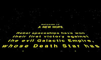
some opening title sequences such as Star Wars (the above) are incredibly simple yet iconic.
i aim for mine to be a lot more complex.

x

Box office Films of this past week.

The top movies of the past week in Norwich were the following:
week starting February 5th
those highlighted in yellow indicate new entries.


Taken from IMDB:
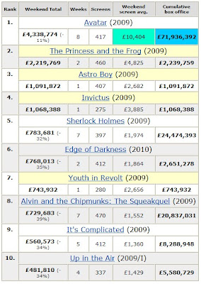
United Kingdom Box Office Returns for the weekend starting 5 February 2010

It shows that The Princess and the Frog, Astro Boy, Invictus and Youth In Revolt are new entries while Avatar remains top film - £69,696,633 above the 2nd most popular.
And in Norwich the movies on show were the following:


From First to Tenth : Avatar, The Princess and The Frog, Wolfman, Youth In Revolt, Astro Boy, Day Breakers, Edge Of Darkness, Invictus, It's Complicated, My Name Is Khan.

Source: Odeon Cinema Listings Norwich

x

Wednesday, February 10, 2010

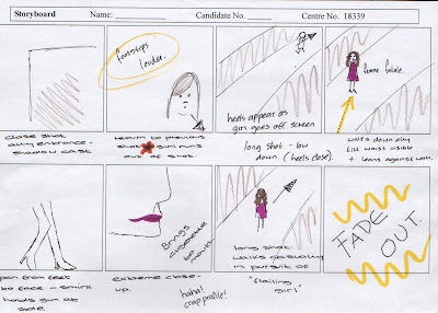
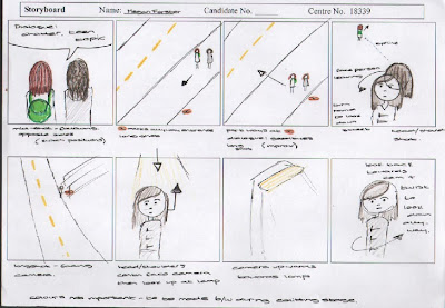
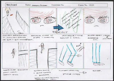
Storyboard (:

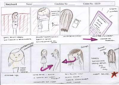
Here is my first attempt at transferring ideas to paper, i admit it's not the clearest or the prettiest but the storyline and the shots are there.
I'll alter this again before filming and then make alterations to the film and create a finished storyboard to fit my final OTS.
x

Saturday, February 6, 2010

Existing Film Noir Stills
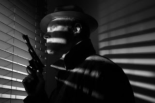
I decided to look into film stills, to see how they used light to create tension and mystery
in Film Noir.

I really like how light has been used in this image, i recognise that it's not just been used in Film Noir but also crossed over into other genres such as "Horror" and "Thriller". I would love to include this in my own OTS but would need to branch into other locations and still make them appear to be one. Many films would involve travelling to different rooms as well as different cities and countries all-together to get certain scenes but still have to make them fit.

This is a still image from "The Big Combo" which shows very effective use of silhouetting, which i experimented with in the previous post. You can see here than it masks the figure's faces but accentuates the femme fatale's feminine shape and the protagonist's costume and stature.


This is alike the shot i attempted at home, where half the face is lit while the other half bathed in shadow (moon phase - half moon). This would be very easy to include in my opening title sequence and very effective as a film noir convention.
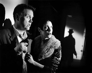
In this shot, light is cast across the faces of the two characters in the forefront while light is cast front behind someone in the doorway to cast a large shadow, this gives the impression that this person is larger and more intimidating than they may be, it creates tension and makes the audience fear what's behind the door. A director may do this to create fear or certain expectations of a certain character (villain).

x

Experimenting with Lighting

Film noir is all about low-key lighting, creating shadow. Lighting is expressionistic, creating mystery for the audience. To prepare for my OTS (opening title sequence), i decided to experiment with lighting angles and creating shadow across the face of a character.
Creating shadow all depends on the position of the person, and the position/angles of the light source. I used a simple bed lamp and used black paper to concentrate the light, and in the first image i used a small umbrella and bounce the light (so the light isn't so focused on the figure), this can give diffuse the light more evenly or create a certain texture/softness to the light rather than the harsh light created when the light is focused.
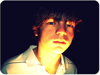

Image One: In this image, the light source is positioned at the bottom of the frame, pointed upwards. This way the bottom half of the face is bathed in light creating shadow around prominent facial features. If my character (OTS) was to use a mobile phone etc then this technique would be useful in lighting the face and creating mystery and shadow.
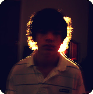
Image Two: In this image, the light is positioned behind the figure, this contrasts the foreground of the figure to the light source behind, and creates a brightened outline around the figure. As i am having a pursuit in my OTS this could be useful to show a figure approaching and creating (again) mystery and suspense, useful if i don't want to reveal the character's face clearly, instantly. By creating this silhouette, it creates tension - typical in Film Noir films.

Image Three: In this image, the light is to the left of the figure, this way the left hand side of the face is lit - casting shadow across the right, unlit side of the face. This brings definition to the facial features and note that the right hand side of the face is only visible by outline.
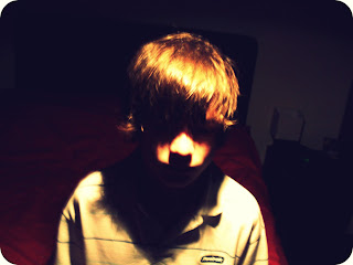
Image Four: In this image, the light is positioned above the figure, creating heavy shadow over the face and making the face difficult to distinguish. This could be very useful in my OTS when my figure is positioned under a street lamp etc as it again shadows the character's face, making them difficult to see clearly, and creates tension for the audience.

I am planning on used both the overhead lighting and the light source positioned below the face in my Opening Title Sequence - as they both create mystery and define the face, this i plan to use of my "victim", this way the audience can recognise facial expressions of worry and terror with ease, while the silhouette created by positioning the light behind i feel would be very effective to use on my femme fatale - this way the feminine silhouette would be highlighted and her face would also be shadowed to create more tension.

x

Tuesday, February 2, 2010

Analysis of Last Post

There are things i must consider when making judgments about films, director choices and actors. Directors choose certain characters not always for appearance but maybe for skills they have, characteristics or the current reputation they uphold.
Jesse McCartney is neither Asian, nor does he have the intimidating appearance that his character gives, but the director (M. Night Shyamalan) maybe had the intention of using McCartney's fame to widen the audience (attracting both female and teen audiences). Despite the fact Prince Zuko's part was re-cast due to conflict over the part, the director may have had previous plans to alter Jesse's appearance and bring out his darker, less all-American teen side.

Conflict Regarding the Film
Yellowface, the key conflict involves the casting of the film, specifically Yellowfacing, which is the practice in American cinema, American theatre, and American television where Asian characters are portrayed by predominantly white actors.
The casting of
white actors in the Asian-influenced Avatar universe triggered negative fan reaction marked by accusations of racism, "racebending", a letter-writing campaign, and a protest outside of a Philadelphia casting call for movie extras. Rathbone and producer Frank Marshall dismissed the complaints. Movie critic Roger Ebert was one of the ones critical of the casting. In February 2009, Dev Patel replaced McCartney, whose tour dates conflicted with a boot camp scheduled for the cast to train in martial arts.
wikipedia


Equally, Noah Ringer - although completely unknown in the film industry - is a 12 year-old regional Texas taekwondo champion, meaning he has the appropriate skills that make him suitable for the character. As well as a fan of the television show. He was supposedly nicknamed "Avatar" because he looks similar to the main character, Aang, a resemblance further heightened by the fact Noah would regularly shave his head. When asked why he keeps his hair shaved, Ringer responded "It keeps me cool when I'm doing taekwondo."
The director would have considered such skills, as this would mean Noah requires no training for the part, in fact he is skilled beyond his years.
Again, conflict sparked over the mainly-Caucasian cast but rumours say Noah Ringer is half-Asian, which could satisfy fans who want loyalty to the original cartoon series.
Although conflicts such as these are commonly unnecessary, the director must satisfy the needs of the target market - which may be why he re-cast Patel as Zuko.

It's Semiotics that encouraged a prejudice comment on my part.
When i see Jesse Mcartney, i see a Blond, American, Pop-singer "heart-throb". Of course through visual changes the director can alter our view of him. People who may have never seen him wouldn't see him in any other way than how director presented him.
But pre-judged views can't frequently be changed despite appearance.

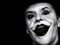
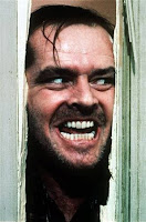
This is reflected by myself. I first saw Jack Nicholson in The Shining where he portrays a father, halfway insane, hearing voices and having hallucinations - he finally cracks and pursues his wife and child with intentions of killing both, his crazed smile representing that. This mirrors his appearance in Batman as the Joker.
Recently i saw Jack Nicholson again with Diane Keaton in Something's Got to Give, where Jack plays a 60-something man who is convinced he's got to date younger women until he finally finds true love in a woman his age, despite the fact they are complete opposites.
Somehow, my mind cannot adjust to this Jack Nicholson, the smile he exchanges with his new love, despite being innocent - still renders me uncomfortable. He's playing a completely diverse character but my mind still thinks this guy is half-crazed and can turn at any moment - i cannot mentally adjust to a love-struck Jack Nicholson. Semiotics do this, i have linked Jack Nicholson with horror and insanity alike my link with Jesse McCartney and pop-music. Some things cannot be corrected with costume and script, which i think M. Night Shyamalan realised when he received such a hostile reaction for his choice of casting.


x

Thursday, January 21, 2010

Choosing the RIGHT actor/actress

I haven't been asked to write about choice of actor but i feel it's important.
The actor/actress you choose must fit the character, and have a certain level of acting skill, they are representing you and you're script, so a bad performance could reflect a bad script to the audience.
I recently found the casting list for the proposed "Summer 2010 blockbuster" and found both mistakes in their choices and good choices in general.


"The Last Air bender" is a film adaption of the Nickelodeon cartoon "AVATAR: The Last Air bender" - Avatar is set in an Asian-influenced world of Chinese martial arts and elemental manipulation. The show drew on elements from East Asian, Japanese and Chinese culture, making it a mixture of an anime like and US domestic cartoons.
The series follows the adventures of the main protagonist Aang and his friends, who must save the world by defeating the evil Fire Lord and ending the destructive war with the Fire Nation.

SUCCESSES IN CASTING:
casting of Avatar Aang


"Last Air bender" Unknown Actor Noah Ringer as Aang, and the Cartoon Aang voiced by Zach Tyler Eisen.
This is a good choice of character, Noah clearly resembles the character, reflects the character's age, build, appearance etc.


MISTAKES IN CASTING:
casting of Prince Zuko


The entire series (Nickelodeon cartoon) is based in an Asian society, and out of the all of the characters it has to be said, Zuko is the teenage, banished, prince and his character reflects the most Asian qualities (dark hair), while the choice of actor is a BLOND, TANNED, AMERICAN, 20-SOMETHING YEAR OLD. When people think of Jesse McCartney, they think pop-singer, American teen, big cheesy grin.


Zuko is hard-faced, grouchy - a dark character, the casting for this is VERY wrong and could anger fans of the programming and it's deeper meaning.
And they did get angry.. which is why they realised the mistake as directors should and recast the part of Zuko to Dev Patel (Slumdog Millionaire), a realised actor who resembles the character Zuko and his strong exterior.

Another mistake i realise now, is that Noah Ringer is completely UNKNOWN as an actor, all i can find out is that he is from Mexico, this is a big risk for the Director to take, considering that he is not aware of the audience's reaction to the boy's acting until the film is released.It is a risk if you're making a high budget film to hand your main part to a new actor, you are unaware of reactions.
Concluding, I felt these points were important to include, as i will be more likely to be thorough in my consideration for actor/actress choice. The person NEEDS to fit the part comfortably and bring the character to life on screen.

x

Wednesday, January 20, 2010

More Semiotics ;D

Semiotics can play a very interesting part in my opening sequence project.
As i only have up to 2/2:30 minutes maximum of time, signifiers can influence an idea or point very simply through bringing in a certain object, symbol, sound, action or colour. For instance, if i wanted to show haste in my filming, i could have sounds of heavy breathing or foot steps.
i watched a previous A level piece and they has a lot of haste/running and then stopping, in between these shots they has the traffic lights changing rapidly, this is a signifier, representational of the running and stopping.
i plan to use signifiers in my opening sequence as they encourage a deeper meaning to what is being shown.
x

Sssssemiotics

What are Semiotics? Why are they important?

Semiotics is the study of sign processes, or signification and communication, signs and symbols, and is usually divided into three branches:

Semantics: Relation between signs and the things to which they refer; their denotata
Syntactics: Relations among signs in formal structures
Pragmatics: Relation between signs and their effects on those (people) who use them


the sign – the picture, object, sound
the system into which signs are organised
the culture within which these signs operate
It is the study of signs and symbols, especially as means of language or communication.
The person who laid the foundation for Semiotics was Saussure.
Saussure is widely considered to be one of the fathers of 20th-century linguistics and of semiotics, and his ideas have had a monumental impact throughout the humanities and social sciences. wikipedia.org
It has a particular interest to media studies when it comes to the analysis of print and film.

Signifiers-Is the actually image, physical apperance or sound.

Signified- Is what the sign reffers to or suggests.
x

Tuesday, January 19, 2010

Inspired (:

Our teacher suggested we write about inspirations, be it people, quotes or new advances in media. Recently released "AVATAR" is set to be the best grossing-film of all time, at the moment stands at second to titanic which it may surpass, this meaning that JAMES CAMERON stands as director of the two best box office films of all time. An achievement to say the least.


The visual effects in avatar can only be described as STUNNING, James Cameron is inspirational for that reason. Throughout his life he fed his imagination with sci-fi and comic books, dreaming up his own world - and after the success of Titanic (1997) he decided to make the film he'd dreamt of, but only if it was as visual and beautiful of that he had designed in his head. He realised technology wasn't sophisticated enough to replicate his ideas the way he wanted.

And so he held back until he introduced the stereotypic camera.

Daily Mail Review:
Tired of waiting for technology to catch up, he co-developed a new generation of stereoscopic cameras.
Simplified, this is the equivalent of two cameras strapped together, each providing a slightly different perspective on the scene, mimicking the way human eyes view the world in three dimensions.
This changes the ballpark of moving images.
If you've had previous experience of 3D, your impression will probably be one of a flattish image with the occasional object 'flying' at you'.
But these advances are different - the entire screen has depth, taking on the appearance of a window through which the viewer is watching a 'world' on the screen, with a distinct foreground and background, rather than a flat, moving painting
In effect, the cinema screen becomes a theatre stage.


'He is inspirational because there's no such this as "i can't", everything can be done in Jim's world - he breaks boundaries' - Michelle Rodriguez (Trudy, Avatar)

'Jim invented the camera, he wrote the story, he created the creatures, he created a whole world' - Sigourney Weaver (Grace, Avatar)


Jim himself is looking to revolutionize how audiences experience films, that's right, not WATCH but experience the film - feel that the place they watch on the screen is real - he wants us to share in the world he's created. I watched an interview with James Cameron on the December 10th, the night of his film premier (Sky1) and he finalised the interview with the following:


" I think AVATAR's another step towards 3D being accepted as almost.. a normal way to do movies. Oh, we're not there yet, but I think in the next couple years, we'll feel that.
3D is gonna be coming to the home, very soon.."

James Cameron - Director, Designer, Editor, Screen Writer, Producer, Inventor


When the Na'vi meet, the greet each other "i see you". The phrase however is more that a greeting. In India, the common greeting Namaskar or Namaste is no simple help. When one says Namaskar to someone, what it means is that he/she acknowledges the spark of the divine that is present inside them. Hinduism believes that God is an all-pervading force that envelopes all beings, this links to the idea of Tsahaylu (the unique connection between a Na'vi member and their Ikran) and the idea that all the creatures on Pandora are connected (..even the trees).
I see you.
an acknowledgement that simply means empathy, you acknowledge the other as one like yourself.
What makes James Cameron so inspirational to people in Media is that technology didn't stop him achieving. When the correct tech wasn't available.. he made it available. When the right stuff wasn't there, he invented it. He solved hims own problems and by doing so - provided help for everyone to advance in thier own ideas.
x
February 1st - i have now been made aware that Avatar HAS surpassed Titantic in the worldwide box-office. Now.. we must convince our teacher to arrange a trip to the iMax cinema in London to see Avatar (: